Author:
Ellen Moore
Date Of Creation:
16 January 2021
Update Date:
1 July 2024
Content
- Steps
- Part 1 of 2: How to Add a Second Y-Axis
- Part 2 of 2: How to change the type of graph that is anchored to the secondary axis
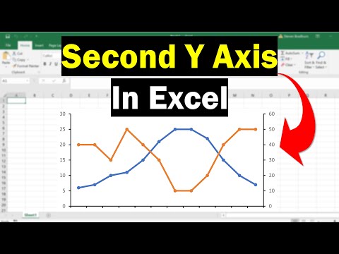
Sometimes you need to show multiple data trends on a single Excel chart. At first glance, this is not so easy if the data is measured in different units. But don't worry - it's actually pretty easy. In this article, we are going to show you how to add a second Y axis to a graph in Microsoft Excel.
Steps
Part 1 of 2: How to Add a Second Y-Axis
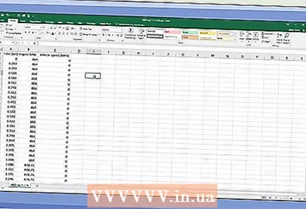 1 Create a spreadsheet with data. Each value should be in a separate cell, and rows and columns should be marked with headings.
  2 Select the data on which to plot the graph. To do this, use the mouse to select the cells with the required data. Also highlight the headings.
 - To select only some cells, hold Ctrl and click on each desired cell.
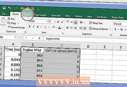 3 Click on Insert. It's on the menu bar at the top of the page. The "Insert" toolbar opens.
  4 Click on the desired chart icon. A graph will be built based on the selected data.
 - You can add a second axis to a line or bar graph.
 5 Double-click the line you want to snap to the second axis. Clicking a line once selects all the data points of that line. Double-clicking will display the Data Point Format menu.
 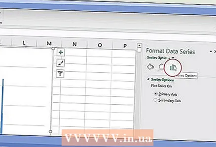 6 Click on the bar graph icon. This icon is called Series Options and is located at the top and right of the Data Point Format menu.
 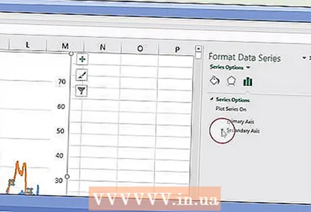 7 Check the box next to "Secondary Axis". You will find this option under Series Options in the Data Point Format menu. A secondary axis with numbers appears on the right side of the graph.
Part 2 of 2: How to change the type of graph that is anchored to the secondary axis
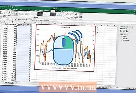 1 Right click on the graph. You will find it in the middle of the Excel spreadsheet. A menu appears next to the graph line.
  2 Click on Change the chart type for a series. A window will open where you can edit the diagram.
 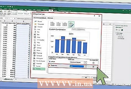 3 Check the boxes next to the required data series. To link other lines to the Y-axis, check the boxes next to the corresponding data series, which are located in the Y-Axis section in the lower-right corner of the window.
  4 Select a chart type for each data series. You can not only link the graph to the second Y-axis, but also change the graph type itself. From the drop-down menu, select a chart type for each data series in the lower right corner of the window.
 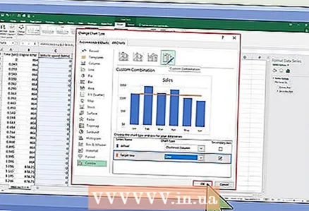 5 Click on Ok. The changes made will be saved.
 - To change the type of the entire chart, click on the desired chart type in the menu on the left, and then double-click on the chart style in the window.


